BLOG
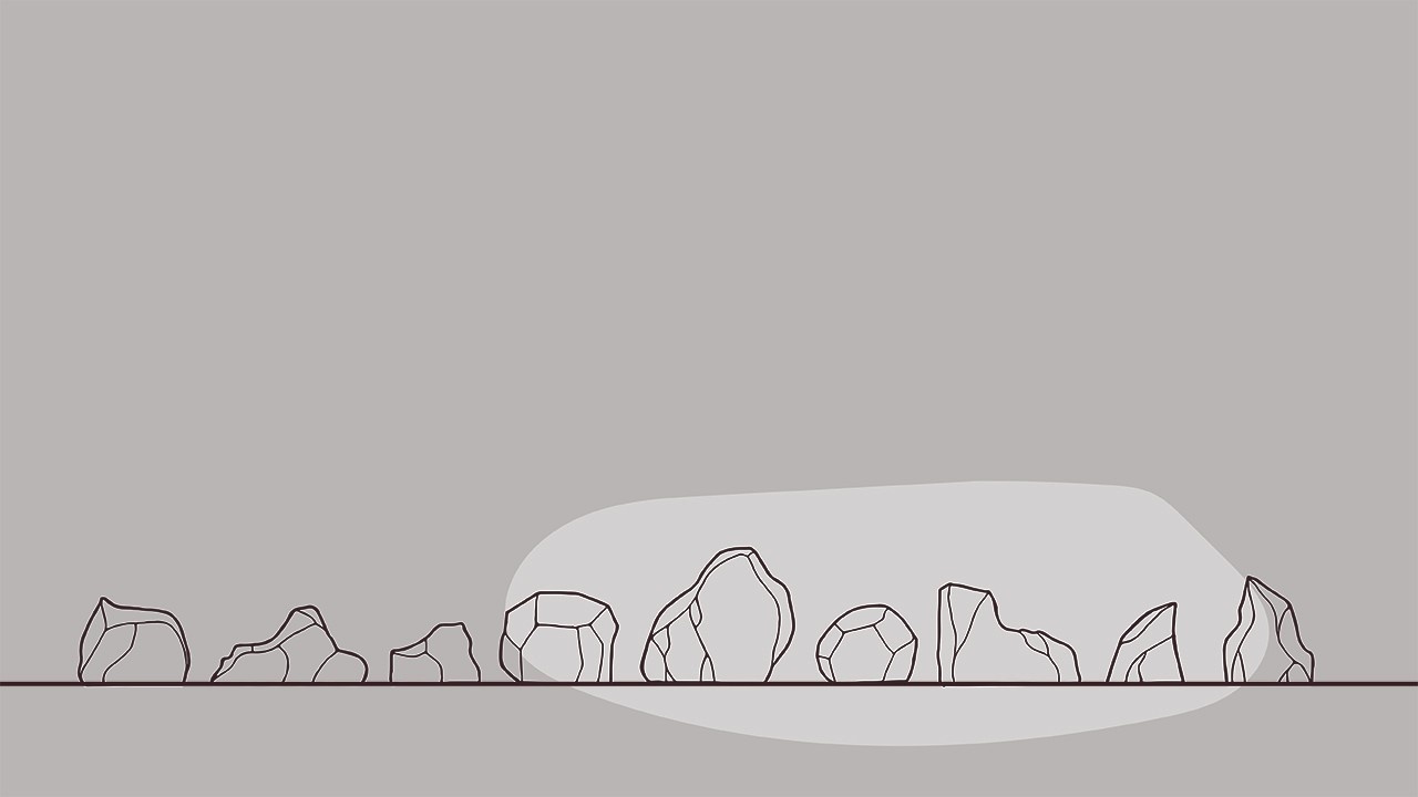
A garden can feel richer and more grounded when using a natural element such as stone. Some would even say it’s the “bones” of a garden (Spirit of Sto...
Style is defined as a particular way of doing something.
We all have our own way of doing things….whether it’s choosing our clothes, doing laundry, d...
This is one of the most popular questions I'm asked...what software should I use to draw my landscape plans? As a landscape design instructor, it's t...
Sometimes I forget to teach the basics about landscape graphics and assume everyone can wield a t-square and triangle to create perfect horizontal and...
Though we can cover many complicated things in design, sometimes I like to step back and cover the basics. Two of those things include how to simply r...
Proper line weights give your drawing depth and clarity. Whether you are drawing by hand or on the computer, line weights are important for visual com...
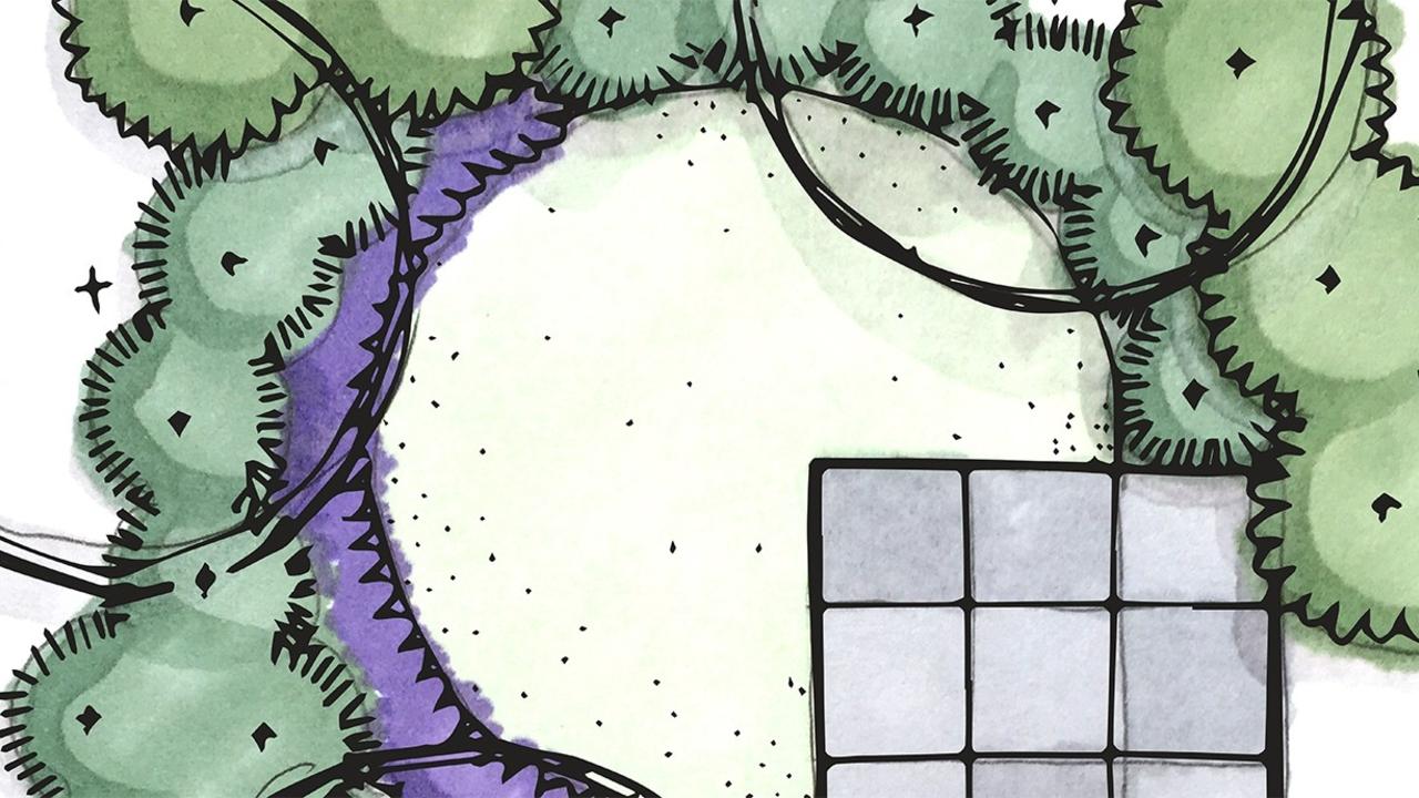
I remember being a little scared as a student when I had to render a plan with those bright, non-forgiving, permanent markers. Over the years I've dev...
One of the many benefits of teaching is the constant inspiration from my students. Lately I've been noticing some lovely north arrows on their landsca...
One of the best ways to design is to draw your ideas in elevation, especially when making a composition of plants. This allows you to visualize the pl...
A wonderful way to combine hand-drawn landscape plans with digital means is to use the one-two punch of Photoshop and Illustrator. In my last post I ...
l love hand-drawing my landscape plans when time allows, but using pen with a dash of color pencil or marker adds a slight bit of nervousness. If your...
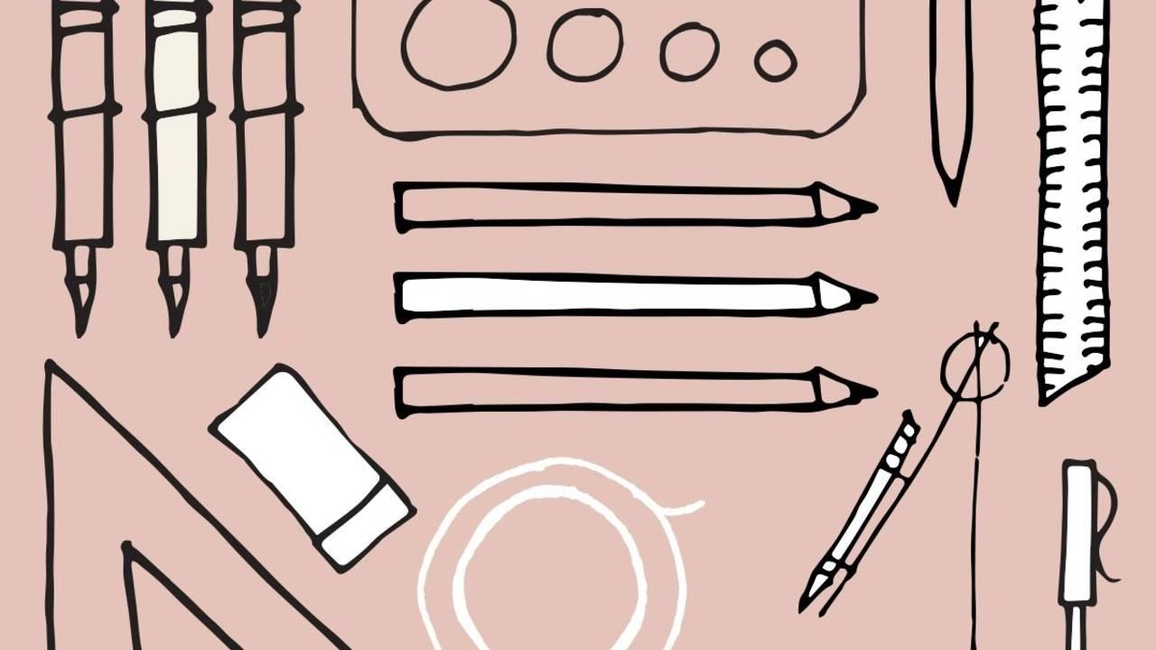
Each year I provide a suggested list of supplies to my students for our fall landscape graphics course. This list is often accompanied by questions of...
Having good contrast on a landscape plan makes it easier to read. One way to add contrast is to include shadows on plants (and objects). Shadows not o...
In the last few weeks I've received several questions about how to choose colors when rendering a landscape plan in marker. In response to your excell...
We are currently learning about color pencil in my landscape graphics class, so I made this tutorial on rendering a plant symbol for my students. As ...
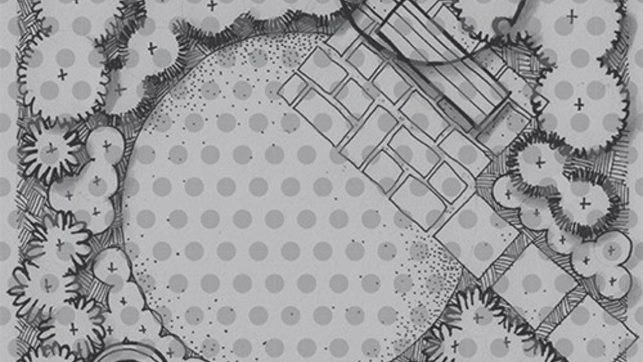
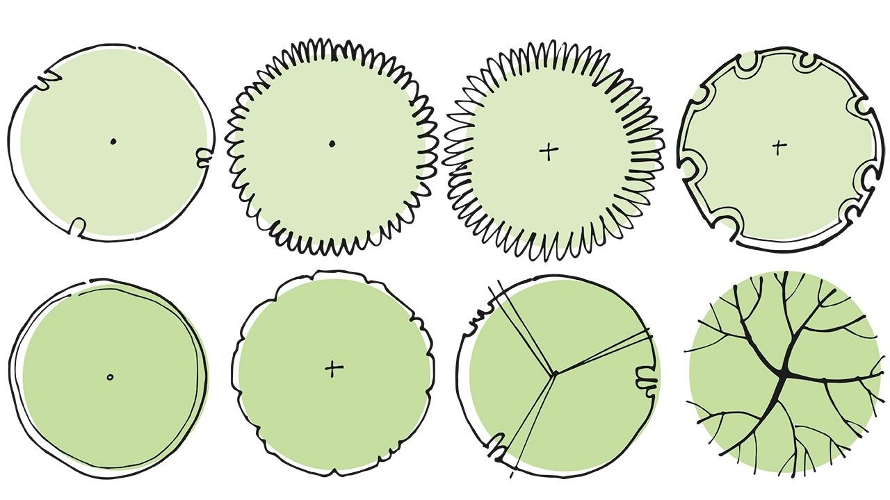
Drawing plant symbols in plan view is a great way to step into garden graphics. It starts with a circle, then you can embellish it as you wish (though...
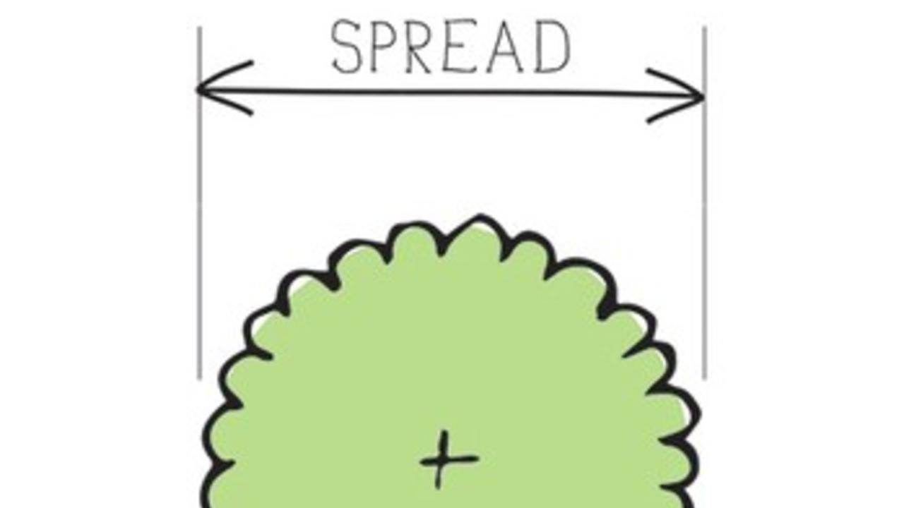
Each year when I teach my students about drawing plant symbols there is always confusion about what I mean by on-center vs. spread, so in anticipation...
I've been wanting to do a proper marker rendering tutorial for awhile, but haven't carved out the time, so thought I'd share a quick sketch I did for ...

