Drawing Ground Textures

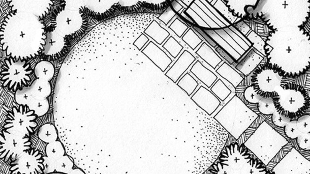
I'm a pen and ink artist to heart so love adding textures to the ground plane in my landscape plans. Yes, they take a little time, but add such character and readability (if done correctly). The key to adding ground textures is achieving a good balance of white to dark spaces or good CONTRAST.

You'll have to think ahead about what will be the white space and what will be dark. I typically make lawn areas the white space, since they are often the strongest and largest area. I use a stippling technique on lawn to accentuate it's space. Stippling is the middle texture below.

If a patio or deck is your largest area, maybe this becomes the white space instead. I often leave plants as white space and make the ground below them dark. This makes them really pop. I leave textures off plants otherwise the plan gets too busy. Another way to add good contrast is adding shadows to everything including plants, furniture and structures. A gray marker works well for that.

Always consider line weights (read more about those here) when adding textures. Textures should be the thinnest line, with any line surrounding it being a little thicker. If you don't use a thin line the textures will overpower your drawing and make it chaotic.
After drawing the plan below I realized that my evergreen plant symbol (like the grouping at the top and bottom center) was competing a bit with the mulch pattern, so I had to darken the plant up a bit. I didn't want to lose the edge of the plant into the texture below it. Sometimes you just need to adjust as you go - or better yet, plan better than I did!

I encourage you to study how textures are used not only on landscape plans, but also in illustrations and graphic design. Most importantly experiment drawing different textures. This is a great reason to doodle! Call it graphic research.


