Developing Your Graphic Style

Style is defined as a particular way of doing something.
We all have our own way of doing things….whether it’s choosing our clothes, doing laundry, designing our gardens...and even drawing. We tend to be okay with how we do most things, but overly critical about how we draw. Most of you draw because you’re designing gardens and need to communicate those ideas to clients. I understand that final drawings, in particular, need to be professional and easy to read, but they can still celebrate your unique style.
It starts with being consistent, then adding your inconsistencies.
 Let me explain.
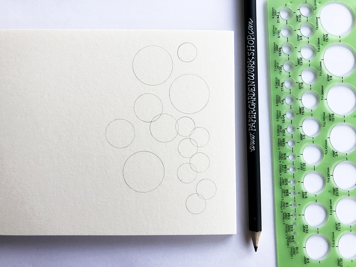
The consistent part starts with creating good structure. This includes using guidelines, circle templates, a straight edge, and fabulous tools like t-squares. Knowing how to create the structure or bones is the secret to a professional, easy-to-read, consistent landscape plan. This part happens in pencil, lighter pencil if possible, because it’s not your final drawing, it’s just the base of it.

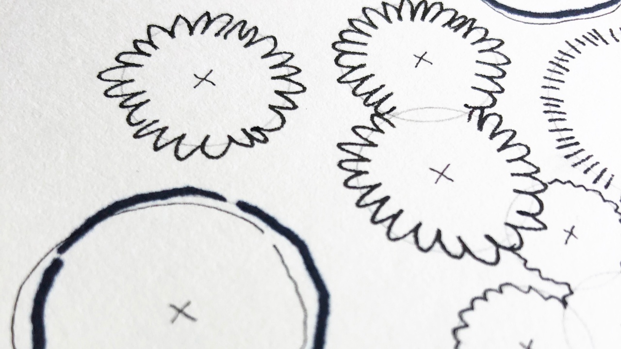
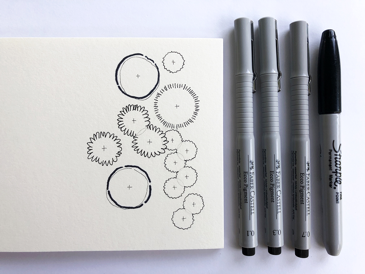
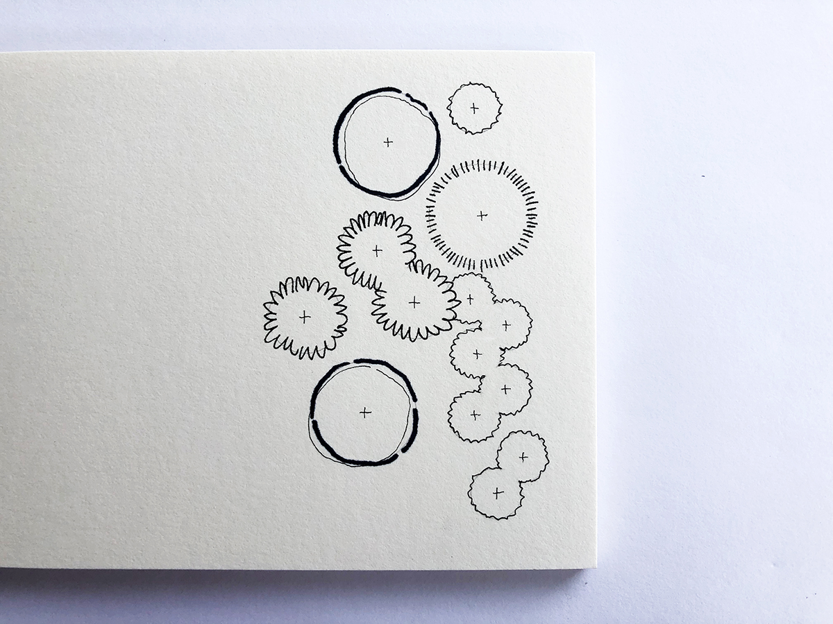
Now comes the cool part, the inconsistency, your flair, your style. Now that you’ve drawn your pencil lines with a fancy drafting tool, you can use a pen or darker/softer pencil to free-hand the final element over that structure. The pencil line (using a tool) gives your drawing that consistent structure, but when you trace it free-hand, your style shines. Your drawing still looks professional, yet still has your character.

Something important to note here is the idea of perfection. Your drawings will never be perfect, if they were you wouldn’t have your style. Imperfection is the foundation of your style. That’s a great thing! Think of the consistency of the pencil line as your safety net. By drawing that first, you’ve already added the “neatness” required in a landscape plan, but when you free-hand your pen lines over that, thus adding your imperfections, that is the engaging character that draws in a client.

A great example of this is when drawing plants. Use a circle template to draw your circles in a light pencil, then free-hand over them in ink with whatever textures and symbols you’d like. Please don’t skip the circle template! This is key to giving your drawing the consistency it needs. A drawing will start to look “messy” when you free-hand both the circle and the ink symbol over it. Try it, you’ll see what I mean.
Your drawings can look professional (consistency), while still celebrating your style (inconsistency). Try both together to see how they elevate your landscape plans to the next engaging level.
If you'd like to dive into this more, join me in Garden Graphics Tool Kit. I'd love to hang out with you! Join my waiting list here.


